// 2026-07-13 · Data & Research · by Bob Smith
Worldometers: Watch the World Tick Over in Real Time
Worldometers runs live counters for population, births, deaths, food, energy, water and more. Open it once and you will stare at spinning numbers far too long.
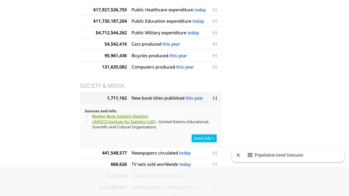
Worldometers is a wall of live counters showing the world happening. Population climbing. Births and deaths this year. Tons of food produced. Barrels of oil left. Cigarettes smoked today. Every number spins upward in real time, and the effect of watching them all at once is genuinely hard to shake.
What is Worldometers?
Global statistics are almost impossible to feel. “Eight billion people” is a phrase, not an image. “Forty million tons of food wasted” is a number your brain files under “large” and forgets.
Worldometers solves this with motion.
The site takes published figures from international agencies, population data, agricultural output, energy consumption, health statistics, and spreads them across the calendar, then renders them as counters that tick at the implied rate. Suddenly you are not reading that a certain number of people are born each year. You are watching births happen, several per second, in front of you.
The front page alone runs counters across population, government and economics, society and media, environment, food, water, energy, and health. Below the fold there are deeper sections: population by country, historical trends, life expectancy tables, emissions data.
It is worth being clear about what those spinning digits are. They are projections, not live feeds, nobody is counting each birth on a sensor. But the underlying data is real, sourced, and documented, and the animation is an honest visualization of the trend rather than a stunt.
What can you do on Worldometers?
- Watch the world population counter. The headline act. It is going up right now.
- Scroll the whole front page slowly. The counters are grouped by theme, and each group tells a small story. The environment section in particular is a lot to take in.
- Click through to a topic page. Every counter links to its full data set, sources, and methodology. This is where it stops being a spectacle and becomes a research tool.
- Browse population by country. Sortable tables covering population, density, growth rate, median age, and urbanization for every country on earth.
- Look up historical data. World population going back centuries, with projections forward.
- Compare countries. Individual country profiles pull together demographic, health, and consumption data in one place.
Tips to get the most out of it
Reload the page and note the difference. Come back an hour later and look at how far a counter has moved. That delta, one hour of the world, is the thing that actually lands.
Follow every counter you care about to its source page. The front page is the hook. The topic pages are the substance, and they include the methodology so you can see exactly what you are looking at.
Use it as a teaching prop. Nothing gets a room’s attention like a live population counter on a projector. It works for classrooms, presentations, and winning arguments about scale.
Take the food and water sections seriously. People come for the population number and stay for “water used this year,” which is quietly the most alarming panel on the page.
Cross-check before you cite it. Worldometers is a great way to grasp a magnitude, but if you are putting a number into something that matters, go to the primary source it links to. Use it as a doorway, not a citation.
Do not doomscroll it. It is easy to sit and watch the death counter for twenty minutes and feel terrible. Look at the trends instead, many of them are improving, which the ticking format does not communicate at all.
If you like Worldometers, also try…
- Our World in Data: the same subjects done as rigorous, beautifully sourced charts with the long-run trends made clear.
- Information Is Beautiful: big data rendered as design, for when you want the numbers to be gorgeous.
- Flightradar24: live global movement of a different kind: every aircraft in the sky, right now.
- earth :: nullschool: the planet’s wind and ocean currents animated in real time.
Dig into more numbers in Data & Research, or go get educated in Learning & Education.
Frequently asked questions
What is Worldometers?
Worldometers is a website that displays live-running counters for global statistics, world population, births and deaths this year, food produced, energy consumed, water used, CO2 emitted, and dozens more. The numbers tick upward in real time based on statistical estimates from sources like the UN and other international agencies. It turns abstract global figures into something you can actually watch happen.
Is Worldometers free?
Yes. All of the counters and country data pages are free to view with no account needed. The site is supported by advertising.
Are the Worldometers numbers real-time measurements?
Not exactly. They are projections, not live sensor readings. Worldometers takes published annual or periodic statistics from international agencies and distributes them across the year, so the counter animates at the average rate implied by the underlying data. The totals are grounded in real statistics; the second-by-second motion is a visualization of the trend.
What can you look up on Worldometers besides the main counters?
There are detailed pages for world population by country, life expectancy, CO2 emissions, water use, and a long list of other topics, plus historical tables and country profiles. Each counter on the front page links through to the data and methodology behind it.