// 2026-08-05 · Data & Research · by Bob Smith
World Births and Deaths: Every Human Arrival and Departure, Live
World Births and Deaths simulates every birth and death on Earth in real time, as a scrolling stream of tiny events. Quietly one of the heaviest pages online.
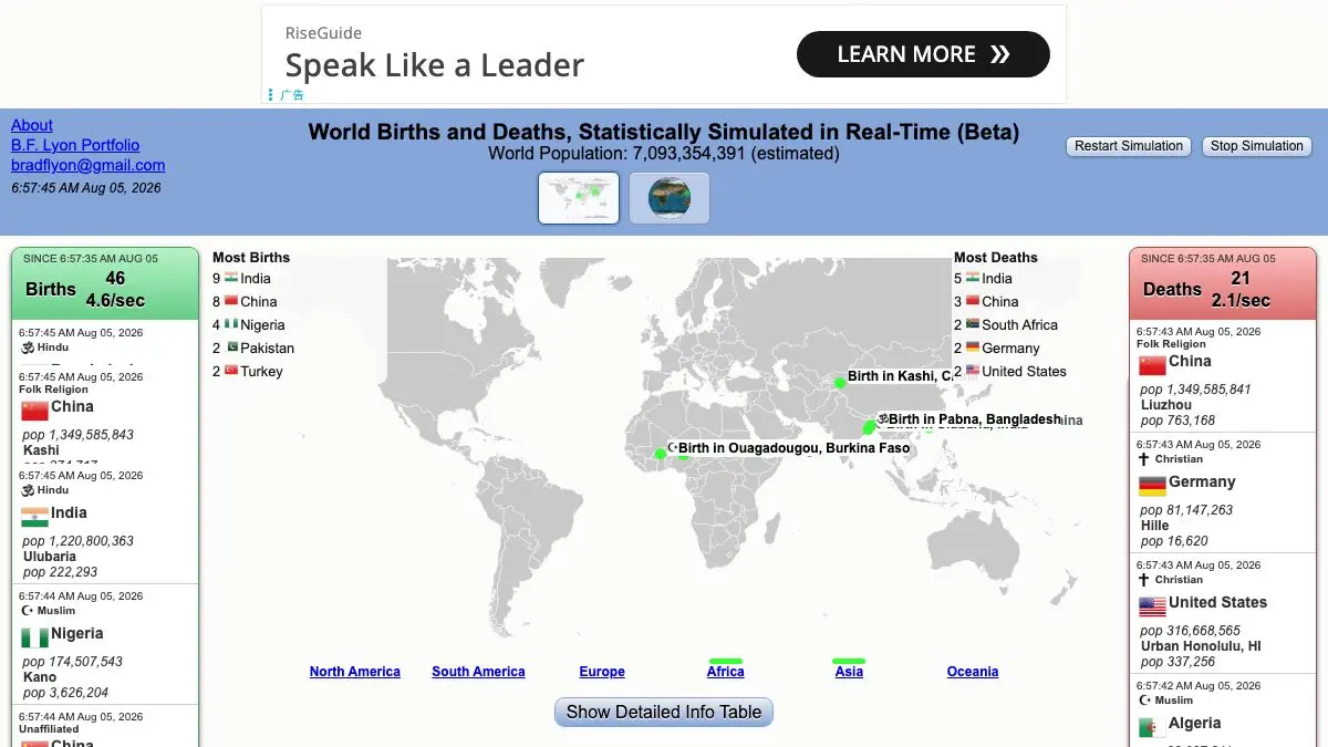
World Births and Deaths does one thing. It shows you, in real time, the rate at which human beings are entering and leaving the world. Two streams of small events, one for births and one for deaths, ticking along at the pace the global statistics imply.
It takes about thirty seconds to understand and considerably longer to stop watching.
What is World Births and Deaths?
Demographic statistics are usually delivered as annual totals. A number with a lot of zeros, in a report, that your brain files away without processing. Roughly 130 million births a year is a fact you can read and feel nothing about.
This site converts that number into tempo. Divide the annual figure down to a per-second rate and render each event as a discrete blip, and the abstraction collapses. Births arrive several times a second. Deaths arrive too, more slowly. Both streams run continuously, forever, with no pause and no end.
The site is careful about what it is, and you should be too: these are simulated events at a real rate, not reported individuals. Nobody has a live global feed of actual births and deaths, because no such system exists or could exist. What the page offers is an accurate visualization of a statistical rate, which is a more honest thing than it might first appear.
The design is minimal to the point of austerity — which is the correct choice, because any additional ornament would turn it into a toy. There is no dashboard, no controls to speak of, no attempt to gamify anything. Just the two streams, running.
What makes it stick is the mismatch between the abstraction and the content. The visual language is that of a system monitor: small uniform events scrolling past at a steady rate. The content is the entire human population turning over. Watching a purely mechanical animation while knowing what each blip stands for produces an odd, specific feeling that very few websites achieve.
The gap between the two streams is worth noticing on its own. Births run visibly faster than deaths, and that difference — plainly legible as a difference in rhythm — is global population growth, which is normally communicated as a percentage that means nothing to anyone.
What can you do with World Births and Deaths?
- Just watch. The intended use. Open it, leave it running, and let the rates register.
- Compare the two streams. The difference in tempo between births and deaths is population growth made audible-in-spirit if not in sound.
- Time a minute. Count roughly how many events pass in sixty seconds, then multiply. The arithmetic lands differently once you have watched it happen.
- Use it as a scale check. Any news figure involving human lives can be held up against this page for a sense of proportion.
- Show it to someone else. It is one of the few statistical visualizations that works instantly on a person who has no interest in statistics.
- Leave it open in the background. As an ambient tab it works remarkably well, in the way that a clock does.
- Read the source note. The page explains what it is estimating and where the rates come from, which is worth two minutes.
Tips to get the most out of it
Give it more than ten seconds. The initial reaction is “neat animation.” The actual effect requires you to keep watching until you stop seeing the animation and start seeing what it represents.
Watch the two streams side by side deliberately. The instinct is to focus on one. The comparison is the more informative view, and it explains population growth better than any chart of the same data.
Do the multiplication yourself. Per-second rates are hard to hold. Working out the per-hour or per-day figure from what you just watched converts a visualization into a number you will remember.
Take the simulation caveat seriously. These are modeled events. Anyone presenting the page as a live feed of real people has misunderstood it, and repeating that claim would be a small but real error.
Pair it with a proper data source. Once the tempo has made an impression, the underlying demography — falling birth rates, aging populations, regional divergence — is genuinely interesting, and there are sites that cover it properly.
Do not open it in a bad mood. Fair warning. It is a page about mortality that runs at several events per second and never stops.
If you like World Births and Deaths, also try…
- Worldometers: the same live-counter idea applied to dozens of global statistics at once.
- Our World in Data: the rigorous long-run demography behind the numbers this page animates.
- How Many People Are In Space Right Now: a much smaller and much more cheerful live human count.
- Listen to Wikipedia: another ambient real-time stream of events, this one made of edits and chimes.
More numbers that refuse to sit still in Data & Research.
Frequently asked questions
What is World Births and Deaths?
It is a single-page website that visualizes the global rate of human births and deaths as a continuous live stream of individual events. Each blip represents one statistically expected birth or death somewhere in the world, paced according to demographic estimates. It is a simulation of the rate, not a feed of real recorded people.
Is the data real?
The rates are based on published demographic estimates for global births and deaths, but the individual events are generated, not reported. No real person's birth or death is being shown. Think of it as an honest visualization of a statistic rather than a record of actual events, since no system on Earth reports every birth and death in real time.
Is World Births and Deaths free?
Yes. It is a free single-page site with no account, no signup and nothing to install. You open it and it runs.
Why are there more births than deaths?
Because the global population is still growing. Births currently outnumber deaths worldwide by a substantial margin, which is exactly what the two streams on the page show — one visibly faster than the other. The gap between them is population growth, rendered as a difference in tempo.
Visit World Births and Deaths →
← All posts · Browse the directory