// 2026-08-10 · Maps & Exploration · by Bob Smith
Open Infrastructure Map: The Power Lines, Pipelines and Cables Under Your Feet
Open Infrastructure Map pulls the world's electricity grids, telecoms routes, oil and gas pipelines and water networks out of OpenStreetMap and draws them on one free, zoomable map.
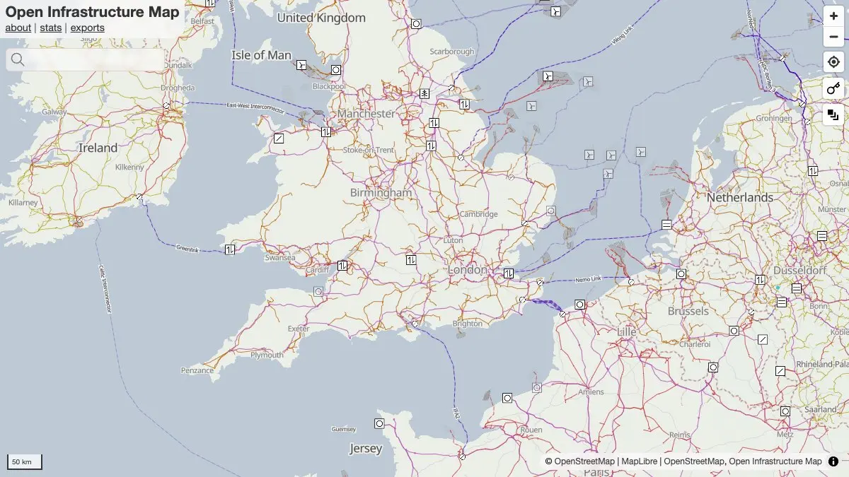
Most maps show you the world people move through. Open Infrastructure Map shows you the one that keeps it running: transmission lines strung across countries, the substations that step them down, pipelines threading under fields, fibre routes, wind farms, water mains.
All of it is already in OpenStreetMap. It just never gets drawn, because the default rendering has roads and cafés to worry about. This site does nothing but draw it.
What is Open Infrastructure Map?
It is a custom view of OpenStreetMap made by Russ Garrett, a British mapper who has been contributing since 2006 and now runs an infrastructure-mapping consultancy on the back of it. The map takes the tags that OSM contributors use for power, telecoms, petroleum and water features, and renders them as their own world.
The power layer is the flagship and the most complete. Lines are coloured by voltage, so a country’s grid reads at a glance: the fat high-voltage backbone in one colour, the regional distribution branching off it in another. Zoom in and individual towers, substations, transformers and generators resolve. Zoom out and you are looking at the shape of a national electricity system, which is a shape almost nobody has seen.
Under the hood it is OSM data filtered with Imposm3 into PostGIS, served as vector tiles by Tegola and rendered with MapLibre GL JS over a Protomaps basemap. That matters mostly because it explains why a map of seven and a half million kilometres of cable pans smoothly.
What can you do on Open Infrastructure Map?
- Trace the grid. Follow a transmission line from a power station across a country and watch it step down through substations to the streets.
- Switch layers. Power, solar generation, telecoms, oil and gas, and water each toggle on and off independently, so you can look at one system at a time or stack them.
- Read voltage by colour. The legend maps colour to voltage class, which turns an abstract tangle into a hierarchy you can actually reason about.
- Find the renewables. Wind farms show as individual turbines and solar generation gets its own layer, which makes the build-out of the last decade very concrete.
- Look under the ground. Petroleum pipelines are tagged by substance and where mapped, by pressure and diameter; the water layer covers fresh water, wastewater, steam and hot water, along with treatment works and pumping stations.
- Check the completeness. The stats pages break down mapped power line length by voltage and by area, which is really a map of who has been doing the mapping.
- Take the data with you. Small extracts come out of Overpass Turbo as GeoJSON; the whole thing is ODbL-licensed OpenStreetMap data, free to reuse with attribution.
Tips to get the most out of it
- Start at your own house and zoom out slowly. The moment this map becomes interesting is when you recognise the pylons at the end of your road and then follow them somewhere.
- Turn layers off, not on. With everything enabled a dense area is soup. Pick one system, understand it, then add the next.
- Read the legend before you form a theory. Voltage colours are the whole language of the power layer, and guessing them wrong makes a distribution line look like a national interconnector.
- Treat gaps as unmapped, not absent. Empty regions almost always mean nobody has traced them yet. The stats pages will tell you which reading applies.
- Click features for their OSM tags. Operator, voltage, substance, capacity and start date are often there, and it is usually more detail than you expected.
- Fix what is wrong. Everything here is editable at the source. If your local substation is missing, adding it in OpenStreetMap puts it on this map — and on every other map built from OSM.
- Compare a country you know with one you do not. Grid topology varies enormously by geography and history, and this is the easiest place to see that side by side.
If you like Open Infrastructure Map, also try…
- MarineTraffic: the same instinct applied to shipping — the other invisible network moving everything around.
- Flightradar24: live aircraft positions, for when you want infrastructure that moves.
- Earth Nullschool: global wind and ocean currents animated on a spinning globe.
- Blitzortung Lightning Map: real-time strikes worldwide, detected by a volunteer sensor network — crowdsourced data with a similar spirit.
Explore more of the planet in our Maps & Exploration collection.
Frequently asked questions
What is Open Infrastructure Map?
Open Infrastructure Map is a free web map that renders the infrastructure data hidden inside OpenStreetMap — power lines, substations, generating stations, wind and solar farms, telecoms cables and masts, oil and gas pipelines, and water and wastewater networks. None of this appears on the standard OpenStreetMap rendering, so the project exists to make a layer of the world that is normally invisible actually legible. It was built and is maintained by Russ Garrett, a UK mapper who also runs the infrastructure-mapping consultancy Infrageomatics.
Is Open Infrastructure Map free and open data?
Yes on both counts. The map is free to browse with no account, and the underlying data is OpenStreetMap, licensed under the Open Database Licence, which means anyone can use it with attribution and share-alike terms. The site's own analysis and statistics are licensed CC-BY. For small extracts you can pull the same features out via Overpass Turbo as GeoJSON; for large processed exports in Shapefile or GeoPackage the maintainer sells commercial extracts through Infrageomatics, but nothing about the map itself is gated.
Where does the data come from, and how accurate is it?
Every feature comes from OpenStreetMap, which means it was traced by a volunteer from aerial imagery, an official open dataset, or a walk down the street. Coverage is therefore uneven: some countries have near-complete transmission networks mapped, others have almost nothing. The site's statistics pages exist precisely to make that visible, breaking down mapped power-line length by voltage class and by area so you can see where the gaps are — over 7.5 million kilometres of power line are mapped worldwide so far. If something near you is missing, you can add it yourself in OpenStreetMap and it will appear here.
What can Open Infrastructure Map be used for?
Practically, it answers questions like where the nearest substation is, which voltage line runs behind a property, where a new solar farm sits relative to the grid, or which route a gas pipeline takes across a region. It gets used by energy researchers, planners, journalists, open-source investigators and grid enthusiasts, and it is a common teaching aid for showing how a national grid is actually shaped. It is a visualisation of open data rather than an official record, so it should inform questions rather than settle them.
Visit Open Infrastructure Map →
← All posts · Browse the directory