// 2026-07-15 · Design & Creativity · by Bob Smith
User Inyerface: The Worst Website, Made on Purpose
User Inyerface is a deliberately awful web form built to teach you what bad UX feels like. One page, infinite rage, and a genuinely useful design lesson.
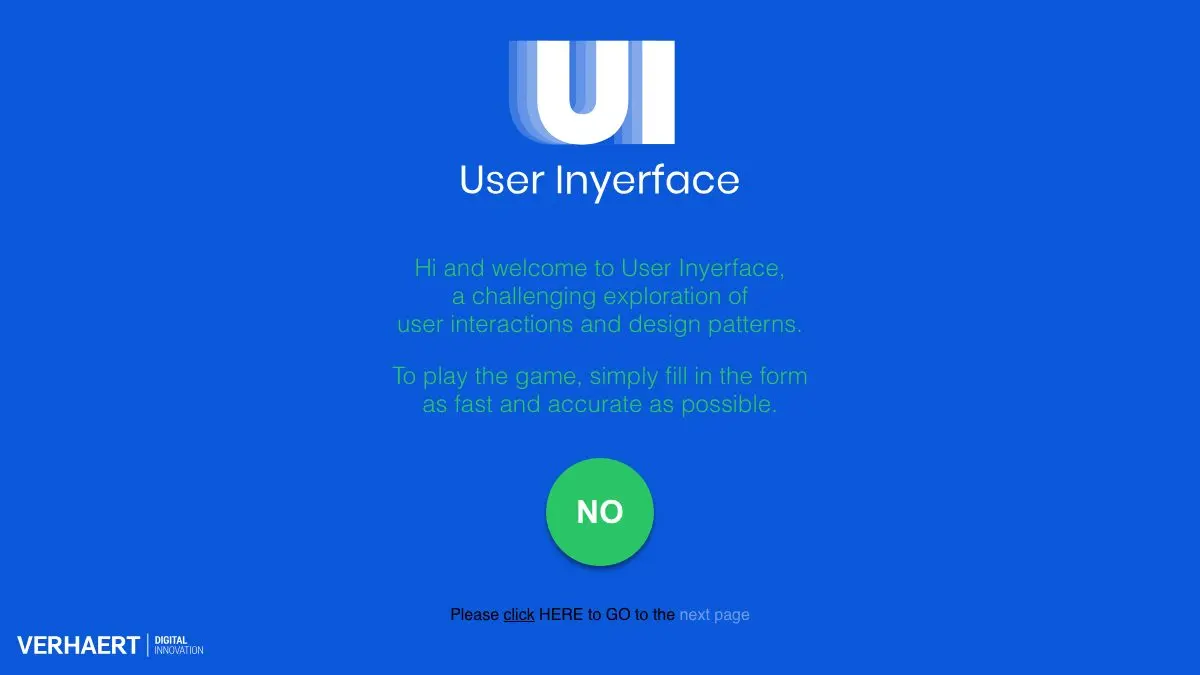
User Inyerface is a browser game that hands you a simple sign-up form and then does everything in its power to stop you from completing it. Buttons lie, checkboxes invert, pop-ups arrive uninvited, and the “helpful” hints are anything but. It is the single fastest way to understand what bad UX actually feels like, and it is weirdly, addictively fun.
You will get angry. That is the feature.
What is User Inyerface?
Built by the team at Verhaert Digital, User Inyerface is a one-sitting design experiment dressed up as a challenge. The brief it gives you is innocent: fill in the form as fast and as accurately as possible. What follows is a gauntlet of every interface crime ever committed, stacked one on top of another with absolutely no mercy.
The genius is that nothing on the page is broken. Every single element works exactly as coded. It is just that the coding is evil. The “NO” is the button you want. The link that looks like body text is the one you need to click. The progress you make is real progress, and it still feels like wading through wet cement.
Designers love it because it is a sermon nobody has to sit through. Everyone else loves it because watching a friend attempt it is better entertainment than most television.
What can you do on User Inyerface?
Not much, technically. Emotionally, everything. Here is what the run throws at you:
- A password field with rules you discover only by breaking them. Every attempt reveals one more requirement, never all of them at once.
- A cookie consent banner that behaves like a Bond villain. Accepting is easy. Declining is a maze.
- Checkbox logic that flips halfway through, so the box you tick to opt out is the box that opts you in.
- A timer that keeps running while you sit there staring at the screen, wondering which of the four identical squares is the actual “next” control.
- Dropdowns, sliders and date pickers that each pick a different, deeply unhelpful interaction model.
- A final screen that is somehow the most infuriating part, and we are not going to spoil it.
There is no tutorial, no hint system, and no mercy. You get the form and your own wits.
Tips to get the most out of it
- Time yourself and race someone. The game is built around speed, and comparing runs turns frustration into competition. Screen-share it and let a friend shout directions at you. Nothing on the internet is funnier.
- Read everything twice before clicking anything. Almost every trap works because you skim. The copy is the puzzle. Slow reading is genuinely the fast route.
- Try the keyboard. Tabbing through fields sidesteps a few of the visual traps that get people stuck on the mouse. It will not save you everywhere, but it feels like cheating when it works.
- Keep a list of what got you. After you finish, write down the five things that hurt most. You have just built yourself a personal UX checklist, and you will start noticing those exact patterns on real checkout pages within a week.
- Play it once as a normal user, then once as a designer. The second run is where the learning happens. You stop reacting and start asking why does this work as an anti-pattern?
The rage fades. The pattern recognition stays. That is a very good trade for fifteen minutes.
If you like User Inyerface, also try…
- Neal.fun: a whole playground of interactive experiments where the interface is the joke, the lesson, or both.
- JS Paint: a pixel-perfect recreation of MS Paint, and a masterclass in how a genuinely good old interface felt.
- Monkeytype: a minimal typing test that is everything User Inyerface is not: clean, fast, and completely out of your way.
- Quick, Draw!: a doodle game with a friendly interface and a neural network trying to guess what you scribbled.
More brilliantly built things to click live in our Design & Creativity collection. Bring your blood pressure medication for this one, though.
Frequently asked questions
What is User Inyerface?
User Inyerface is a browser game that presents you with a sign-up form built entirely out of bad design decisions. Your goal is to fill it in as fast and as accurately as you can, while every button, checkbox and pop-up works against you. It was made by Verhaert Digital as a playable lesson in what hostile interfaces feel like from the user's side.
Is User Inyerface free?
Yes. User Inyerface runs in any modern browser with no account, no download and no payment. You just open the page and start suffering, which is the whole point.
How long does User Inyerface take to finish?
Most first-timers take somewhere between five and fifteen minutes, and plenty of people rage-quit before the end. Once you know where the traps are you can cut that down dramatically, which is why it works so well as a race between friends.
What is the point of User Inyerface?
It is a teaching tool disguised as a game. Every frustrating moment maps to a real design anti-pattern such as inverted button colors, confusing copy, hidden controls and dark patterns in consent dialogs, so you come away able to spot those tricks on real websites.